plotter draws the five charts every statistics classroom
runs on: the histogram, the bar chart, the
pie chart, the box plot, and the
scatter plot. Each is a single word: hand it a canvas and
your data, and it hands the canvas back with the picture on it.
stats does the arithmetic underneath (bins,
quantiles, outlier fences). scribbler does
the drawing (rectangles, circles, flood fills, the 8×8 text). So this
machine is the meeting point of the two: numbers on one side,
pixels on the other, pure Shoddy in between.
Every chart this machine draws was invented by somebody, and three of the five by the same man. William Playfair was a Scottish engineer's draughtsman turned political economist, and by most accounts a rogue. He published the line chart and the bar chart in his Commercial and Political Atlas of 1786, and the pie chart in 1801. His argument, radical at the time, was that a shape shows a quantity's behaviour faster than the table of numbers ever could. The scientific establishment ignored him for most of a century. The histogram is Karl Pearson's, named in his 1890s statistics lectures as the picture of a distribution. The box plot is the baby of the family: John Tukey introduced it in the 1970s, as part of his campaign for looking at data before theorising about it. That is the whole span of this machine: five pictures, two centuries, one shared conviction, that the fastest route from a list of numbers to an understanding of them is through the eye.
A mean and a standard deviation tell you what the data is. A picture
tells you what it looks like, and half of introductory
statistics is learning that those are different things. A distribution that
seems tame in summary can turn out lopsided in its histogram. One wild point
that vanishes inside an average jumps straight off a box plot. A correlation
coefficient of 0.8 means much more once you have seen the cloud of dots lean.
plotter makes the picture as cheap as the number:
Histogram(NewPlot(360, 260), scores, 8) and you are looking at
the shape of your class's grades. And because charts are ordinary values on
an ordinary scribbler, they compose with everything else. Add a title, draw
on top, read pixels back, or blit to a window (copy the finished pixels to
the screen) when you are ready.
Include the file (it brings stats and scribbler along, and everything
they include). The rhythm is always the same: NewPlot for a
white canvas, one chart word, then ScribblerBlit when you want
to see it:
Include "plotter.shoddy"

Def Main()
    Let scores = { 72, 85, 91, 68, 77, 85, 94, 81, 60, 88 }

    ' The shape of the class: a histogram in 5 bins
    Let h = Histogram(NewPlot(360, 260), scores, 5)
    Let shown = ScribblerBlit(PlotTitle(h, "CLASS SCORES"))

    ' Sales by day, coloured bars with labels
    Let b = BarChart(NewPlot(360, 260), { "MON", "TUE", "WED" }, { 12, 19, 8 })

    ' Shares of a whole, with a legend
    Let p = PieChart(NewPlot(360, 260), { "CATS", "DOGS", "BIRDS" }, { 9, 7, 4 })

    ' Spread and outliers at a glance
    Let x = BoxPlot(NewPlot(360, 200), scores)

    ' Two variables against each other
    Let s = ScatterPlot(NewPlot(360, 260), { 1, 2, 3, 4 }, { 2, 3, 5, 9 })
(See tst/plotter-demo.shoddy for a runnable tour of all
five charts.)
A few things worth remembering:
NewPlot
paints it white once; after that every word only adds pixels. That is what
lets PlotTitle write over the top margin, and it means you can
draw extra annotations with the scribbler words afterwards.Outliers, so the picture and the word always agree.ScribblerBlit to
show the window. That is also why the whole machine is testable headlessly,
with no display at all: the tests read pixels
straight out of the buffer and never open a window.ScribblerSave(sc, path) writes the buffer to a PNG without
consulting a window, so a chart can go straight to a file. Run the mill
with --no-window and nothing reaches the screen at all. The
tally mill does exactly this: its
window.capture key is one ScribblerSave, and its
capture build target is that flag.Every chart-facing word, plus the Rgb type and the layout helpers
| Word | Description |
|---|---|
| NewPlot(w, h) | Open a scribbler of that pixel size and paint it white. The canvas every chart expects. |
| PlotTitle(sc, s) | Write s centred along the
top edge, in black. |
| Word | Description |
|---|---|
| Histogram(sc, xs, n) | Frequency histogram: xs
split into n equal-width bins from min to max, bars scaled to
the fullest bin. The top edge of the range belongs to the last
bin. |
| BarChart(sc, labels, values) | One coloured bar per category, labelled underneath, heights from zero to the largest value. Values must be non-negative. |
| PieChart(sc, labels, values) | Each value's share of the total as a wedge, clockwise from 12 o'clock, with a colour-swatch legend on the right. Values must be positive. |
| BoxPlot(sc, xs) | Horizontal box-and-whisker: box from Q1 to Q3 (the data's quarter marks), median line, whiskers to the last values inside the 1.5×IQR fences, outliers dotted red. |
| ScatterPlot(sc, xs, ys) | A radius-2 dot per (x, y) pair, both axes scaled to their data's range. |
| Word | Description |
|---|---|
| Rgb | A colour record: fields R,
G, B, each 0–255. |
| Palette() | The six series colours, as a
List Of Rgb: the familiar chart blue, orange, green, red,
purple, brown. |
| PlotColor(k) | The k-th series colour, cycling past six. |
| Word | Description |
|---|---|
| PlotX0() / PlotX1(sc) / PlotY0() / PlotY1(sc) | The plot
area's pixel edges (y grows downward, so PlotY0 is the
top). |
| ScaleTo(v, lo, hi, p0, p1) | Map v from
[lo, hi] onto pixels [p0, p1], rounded; a flat domain lands
mid-range. |
| DrawAxes(sc) | Black x- and y-axis lines along the plot area's bottom and left edges. |
| XLabels / YLabels(sc, lo, hi) | Min and max labels along an axis. |
| LabelOf(v) | Axis lettering: v rounded to two
decimals, as a string. |
| BinCounts(xs, n) / BinIndex(x, lo, span, n) | The histogram's binning, usable on its own for a frequency table by interval. |
| User | How | |
|---|---|---|
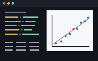 | tally | All five charts.
Which one gets drawn is chart.type in a spec file, dispatched to
Histogram, BarChart, PieChart,
BoxPlot or ScatterPlot; ScaleTo and
PlotColor place its regression line over the scatter. |
tst/plotter-demo.shoddy is the smaller showcase, drawing all
five onto one canvas.
| Machine | Why | |
|---|---|---|
 | scribbler | Every chart mark lands through the draw words: lines, rects, circles and flood fills. |
 | seq | Zip pairs the series, Taken trims it to the axis,
and Any and CountIf decide the ticks. |
 | stats | Sum,
Maximum, Minimum, Quantile and
Median: axis ranges and the distribution marks come from the
summaries. |
 Shoddy · The Machines